
Location-Based Free Events: Proximity App
Timeline
20 weeks
(6 months)
My Role
UX Researcher
Interviewer
Designer
Team
4 designers
Process
Research
Ideation
Design
Prototyping
Usability Testing
Tools
Figma
FigJam
Miro
DaVinci Resolve
Procreate
Overview
Students are often expected to balance their school work, social life, and their budgets, which can be increasingly difficult when non-academic activities require them to spend money. We made a new product to facilitate affordable activities and events for college students on a budget.
Problem Statement
“How might we help UW students on a budget in the Seattle area make decisions on how to attend free in-person activities and events?”
Product Video
In “Paisley Meets Proximity,” a Proximity user named Paisley is new to UW. She heard about the Proximity app during the Dawg Daze welcome week on campus. After downloading it, she receives a notification for an upcoming event. She RSVP’s and goes to the event. After becoming a frequent user of the app, she unlocks the ability to upload other event posters on the app, so she uploads an event for her club. Another student, Phoebe, gets a notification for the event and the two meet at the event.
Timeline
Our design process spanned 20 weeks, progressing through research, ideation, design, and development.

Research
Our research started with brainstorming and a competitor analysis, which lead us to user interviews. We analyzed our interview data to determine the behavior and needs of our typical users through a user journey and two personas.
Competitor Analysis
We analyzed four competitor products: Meetup, Nudge, Bumble BFF, and bulletin boards.Our analysis of these products helped frame our goals for our solution and the rest of our research.
Interviews
We conducted four total interviews. Our inclusion criteria was people of the age range 16 to 26 who live in Seattle. Two of our participants were UW students and two were UW graduates.
Our interviews aimed to answer three research questions:
Why do young adults struggle to find free activities?
What factors besides money restrict young adults from exploring hobbies?
How do young adults make decisions about attending free activities?

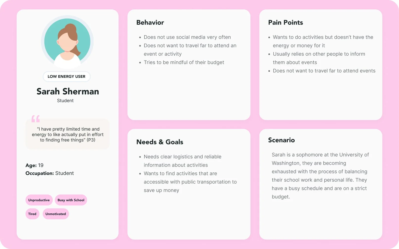
Personas
Our team summarized our research findings by creating two personas that described users with high energy and users with low energy.

Findings
The paywall present in all three apps was the most noticeable weakness in these competitors.
Most competitors lacked features for how to fit an activity into the user’s personal schedule.
Most of these products relied on user’s previously stated interests. This was helpful to provide the user with events that they would find interesting.
Findings
Participants wanted to find activities that suit their interests and hobbies, ideally, other attendees of events would also have similar interests.
Participants ran into challenges when searching for reliable and efficient information about an event, unclear logistics was a commonality.
Participants want to do activities but don’t have the energy to find and participate.

User Journey Map
Our user journey highlights Sarah’s experience attending a free 5k running event. The main issues highlighted at the beginning are that it is difficult to find free things to do initially and having confusing logistical information about a free event.

Ideation
Our ideation started with clear goals based on our research insights. Then we brainstormed design ideas and sorted them based on our goal criteria. This lead us to our three initial ideas and storyboards.
Design Requirements
Our requirements address motivation, clear logistics, organization, catering towards specific interests, amount of effort for the user, and whether it supports a low budget. We felt that these criteria were important to our users based on our previous user research. We focused primarily on implementing the first two requirements.
By gathering insights from our research, we were able to make informed decisions throughout our following ideation and design processes.
Design Goals
We created three design goals to ensure that our solutions meet the needs and goals of our users that we found during our research.

Initial Idea Sketches
These sketches showcase the ideation process and how our team explored different design possibilities, highlighting how we refined our concepts based on user needs and research insights.

Storyboards

AR Marker Jewelry for Motivation
Sarah has availability in her schedule and is notified that there is a free activity that she can participate in. She notifies her friends who also have availability in their schedules and participates in the event.
Campus Connect App
Sarah is trying to plan a hang-out with a friend next week, but she is struggling to find an activity that is affordable and fits in her schedule.
Activity Card
Sarah finds a flyer for a free activity in the library. She rents an activity card from the library and uses it to attend an event that is free for students. She leaves the event feeling content and wants to attend more events like this in the future using her activity card.
Design Proposal


Final Design Idea
After receiving feedback on our ideas and narrowing our problem scope, we decided to focus on creating an app focused on sourcing affordable events. Through this idea, we felt that we would be able to achieve our design goals while meeting the needs of our users.
This is an app called Proximity.
Design Review Feedback
After 10 weeks of research and design, we presented our initial ideas to two industry professionals. We received two valuable critiques that influenced our process.
Our problem scope was too broad
The link between our ideations and research was not strong enough
We proposed three initial design ideas:
1. Campus Connect App
It is an application that would be free to download on a mobile device. This design highlights affordability by connecting with University of Washington calendars and registered student organizations.
1. AR Marker Jewelry (Ring, Necklace, or Bracelet) for Motivation
We wanted to incorporate a wearable design to stray away from a phone app with notifications as those are easy to ignore.
3. Activity Card
This design sketch is about a card that university and school students can borrow from libraries or download online to access free events and activities in their local area.
Prototyping
Information Architecture
We created an information architecture diagram to determine how our low fidelity prototype will be organized.
We learned that this is important to consider how users will be interacting with the app. For example: If a user enters the app via clicking on a notification on their lock screen, then the app will open to a pop-up on the Home screen with more information on the event.
Iteration #1


Changes we made to our prototype:
Removed horizontally scrolling buttons
Added a search and filter option to address concerns about seeing events in advance
Introduced a new feature for scanning event posters that is only available to verified users and organizations
Addressed concerns about how events are uploaded to the app by including the scanning feature
Low-Fidelity Prototype
This shows how the user moves through the app. Each screen is labeled, and arrows show how they connect, with actions listed along the way. This helps us see the user’s journey step by step and make sure everything flows smoothly.
Pop-Up Notification Pathway
Plan-Your-Journey Pathway
Concept Testing
We concept tested our low fidelity prototype with four users. This gave us valuable insights into the direction that we wanted to take our design. We gathered four key findings from these tests.
Findings:
Users did not know that the buttons on the event overlay scrolled horizontally
Users wanted to see events in advance
Users wondered about incentives and a rewards program
Users asked for more information about the event and how it is being uploaded to the app
Quote from users:
“How does the app source events? Is it crowdsourced? I would want to know the source of the event for more information” (P1)
Mid-Fidelity Interactive Prototype


Changes we made to our prototype:
Ensured that all back buttons and buttons in general are uniform, including that there is a way to navigate backwards or exit from every page
Improved the map functionality on the home page and when filtering events.
Improved the ‘Plan your Journey’ pathway as users did not understand the purpose of it and found it hard to navigate through.
Made the UI style consistent throughout the app, including text styles, color, sizing, spacing, and margins.
Usability Testing
We conducted usability testing of our high fidelity prototype by asking users to complete four tasks within the app. We asked users to think aloud and observed how they were navigating the app interface. Each team member conducted a session with one participant for a total of four participants.
Findings:
Users identified navigation issues
Users wanted the tasks to be more simple
Users enjoyed how information was organized
Users felt that there was unnecessary information


Quote from users:
Participant 1 liked task 3 and felt that “the slide up was clear to read the information” and “I like that the time is first under info” (P1)
High-Fidelity Interactive Prototype


Homescreen
Event Details
Setting a Goal
Upload an Event Poster


Reflection & Lessons Learned
Throughout this project, I have realized how important it is to base your designs on solid research. Without ample research into your users’ pain points and needs, it is impossible to make a product that improves people’s lives.
The time constraints of this academic project made it difficult to conduct thorough research, and in the future I aim to approach projects from a more informed perspective.
This project also helped me develop my user research skills, Figma prototyping skills, and usability testing skills. It was valuable to learn how to summarize findings and apply that knowledge to make design choices. Working with this team has taught me about time management, teamwork, leadership, and communication. I am excited to apply what I have learned to future teams and design environments.